Flat Rate Shipping
E-commerce
I designed and owned the end-to-end experience for a new purchase flow that lets users pay just one shipping fee for their entire order of flat rate eligible products.
Team Members
PM, engineer, data analyst, UX writer, and illustrator.
Impact
Buyer conversion rate
+13%
Customer retention rate
+3%
Role
Product Designer
Company
Wish
Duration
2 week sprint
Status
Shipped Q2 2023
Average Transaction Value
+21%
Project Overview
User studies show that one of the biggest barriers for users to complete a purchase on Wish are the high shipping costs for individual items. Currently, if a user wants to purchase multiple items from the same product listing, eg. multiple bowls, different nail polishes colours, etc, they have to pay shipping fees for each item they order.

User sees nail polish colours that they like, and adds 3 colours to their cart.
New flow
In the cart, users see that there’s a $6 shipping fee per polish

Current flow
Users are hit with a hefty $30 shipping price for 3 nail polishes
Measuring Success
By offering flat rate shipping, we hoped to see an improvement in customer retention rate, an increase in average transaction value, and an increase in buyer conversion rate.
Design Goals
To maximize the design’s impact and ensure our success metrics are met, I mapped our success metrics to design goals that would guide design decisions throughout the feature.
Key Features

Outcomes
Launched to all eligible orders in the U.S in late January, followed by over 20 countries including Canada, Australia, the UK, Italy, Spain, France, Germany, Czech Republic, Japan, Brazil, Mexico, etc
Incentivized users to build bigger baskets - average transaction value increased by 21% attributable to the launch of flat rate shipping
Increased buyer conversion rate of ~13% y/y in Q2 2023
Customer retention rate improved by ~3% y/y in Q2 2023
Why does this happen?
I worked with a data analyst to look into the shipping logistics and learned that there’s actually significant cost savings that incur when users purchase multiple items which can be being shipped together, however, these savings are passed onto the merchants instead of the shopper.
When users purchase multiple items, the items are combined in a shipment center. The more items a user purchases, the more the merchant saves on packaging and logistic costs.
The Proposal
My team saw an opportunity to drive basket building while improving the customer shopping experience. Users will be encouraged to have a single, larger transaction instead of several smaller ones. Because users are purchasing more items, the logistics costs for merchants to combine items decreases, and we pass those savings to our users.
Item prices will increase a bit with this model, but overall this is much more cost efficient for users. With this new model, both merchants and users will save money.

Success metric: Increase customer retention by removing the biggest barrier of purchase
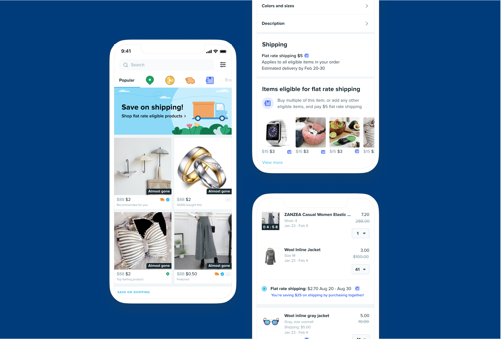
Design goal: Introduce strategic, intuitive entrypoints that educate users learn about flat rate shipping and how it works
Success metric: Increase average order value
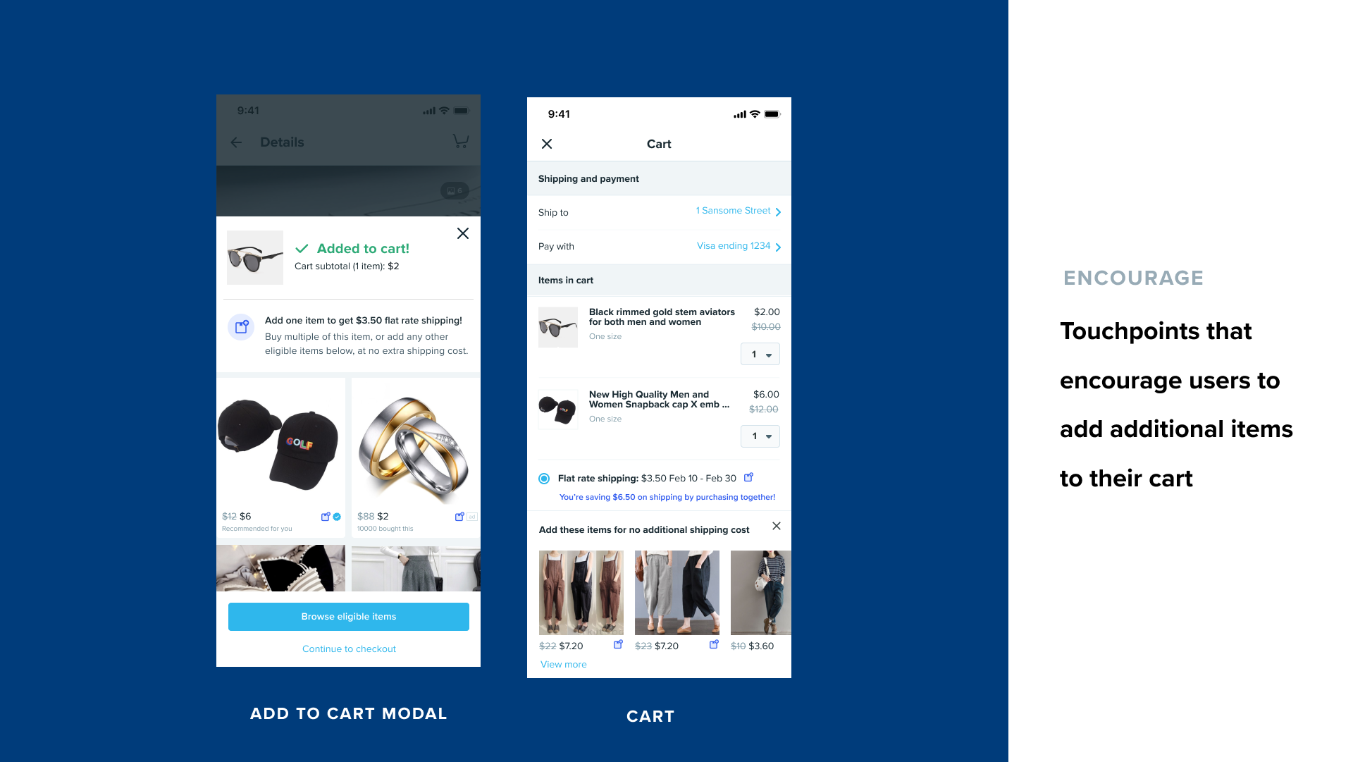
Design goal: Create touchpoints that encourage users to add additional items to their cart
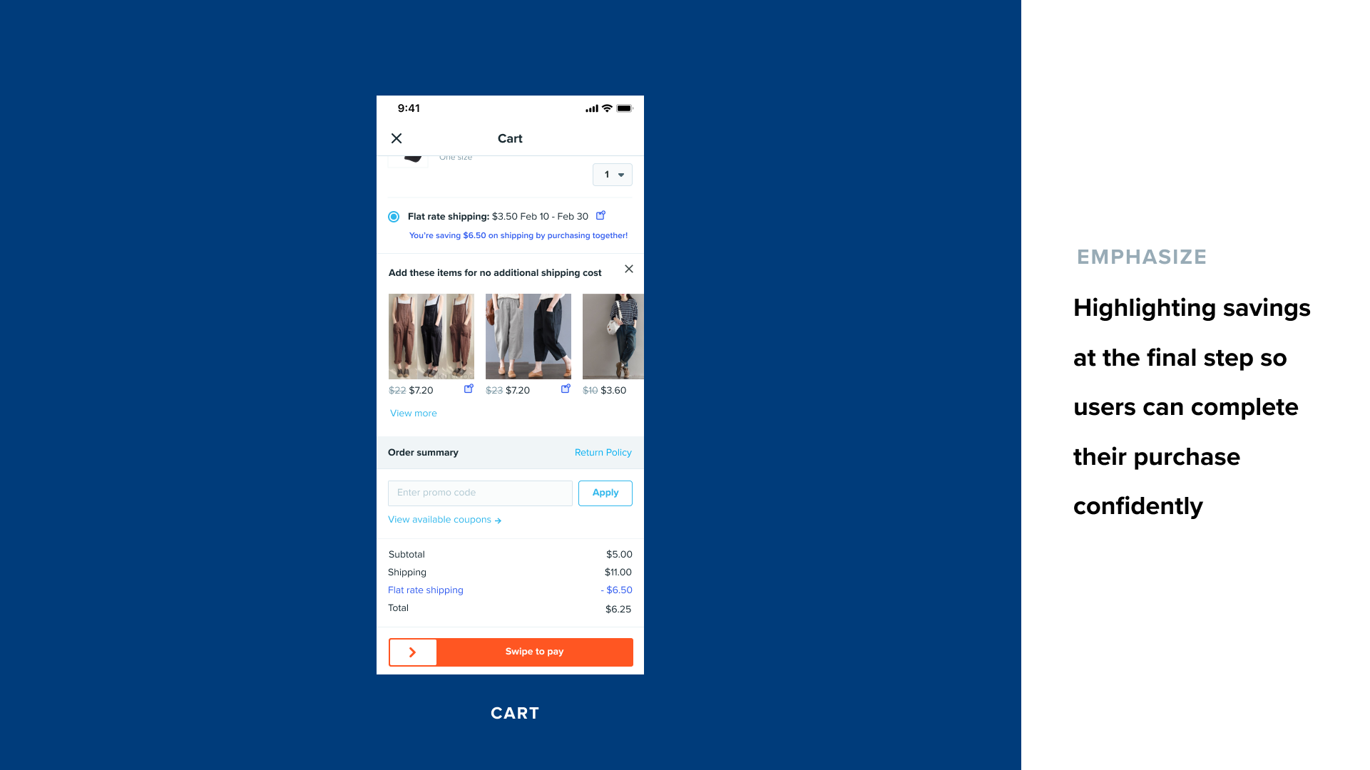
Design goal: Emphasize value and highlighting user savings to help with purchase completion
Success metric: Increase buyer conversion rate
Key Takeaways
Time management is crucial. Because of the 2 week sprint deadline, the biggest challenge I faced was managing my time between this sprint and 2 other projects from different domains which ran at the same time. Additionally, I had to coordinate timelines between our UX writer, data scientist, illustrator and engineer to ensure assets were delivered on time. Without careful planning and time allocation, this project would not have been completed on time.
Be curious. Working on this project, I learned so much about what really happens behind the scenes from when a customer orders an item to when it arrives on their door. Understanding the context and really digging into the space helped me make designs that not only work conceptually but logistically as well.
User Testing and Iterating
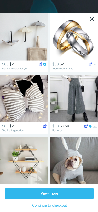
I ran user test sessions with 12 users to get user feedback on the designs and learn which entrypoints were most impactful and iterated on the designs. To streamline the user flow and reduce distractions to checkout, I made the following changes:
removed the product tile entrypoint (low click rate)
removed product strip on the product detail page
removed the related tab on the product detail page
removed quick add to cart


Final Features
Before

After
Before
After
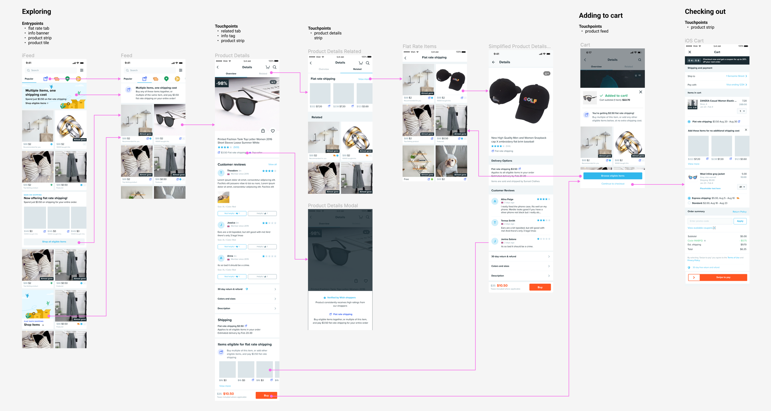
Mapping the Flow
Working with my PM, I mapped out Wish’s current purchase flow to find opportunities to create intuitive entry points that educating our users, encourage our users to add items to their cart, and emphasize their savings with flat rate shipping. I made sure to keep engineering in the loop to check for feasibility of implementing these touchpoints into our existing flow. Working with a UX writer and illustrator, we came up with assets that would effectively communicate what flat rate shipping offers.
I then created components that fit within Wish’s design system, and created wireframes to highlight where these components could exist within our current user flow.